
Increasing Feature Adoption from 8% to 50% within 3 Months
This project resolves user confusion and extreme drop-offs at the final reward claiming stage to increase daily active users, revive market demand, and compensate for the company's initial engineering costs.
Type: B2C
Industry: Fintech, Web3 & Crypto
Team: 1 Product Designer (me), 1 UX Researcher, Product Manager, Marketing Head
My Role: End-to-end UX ownership, leading discovery, comparative usability testing, and final UI execution
About FOCII
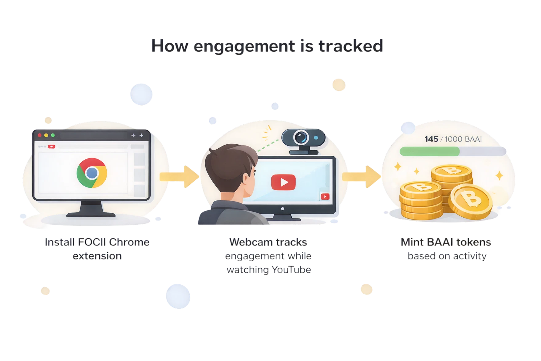
FOCII is an AI-driven verification tool designed to prove a YouTube viewer is an actual human being rather than a bot. It rewards you for your Youtube engagement, by passively tracking attention.
- How it works: It uses your desktop webcam to track face and eye movement while you watch YouTube videos to gather engagement analytics.
- Adoption Number: Currently in its Minimum Viable Product (MVP) beta testing phase and has 173 active users on the Chrome Web Store. It was rolled out around June 2024.
Target Audience
Over 25 million people worldwide are heavy daily internet users who also own crypto, making them a highly active and valuable audience.

Problem Statement
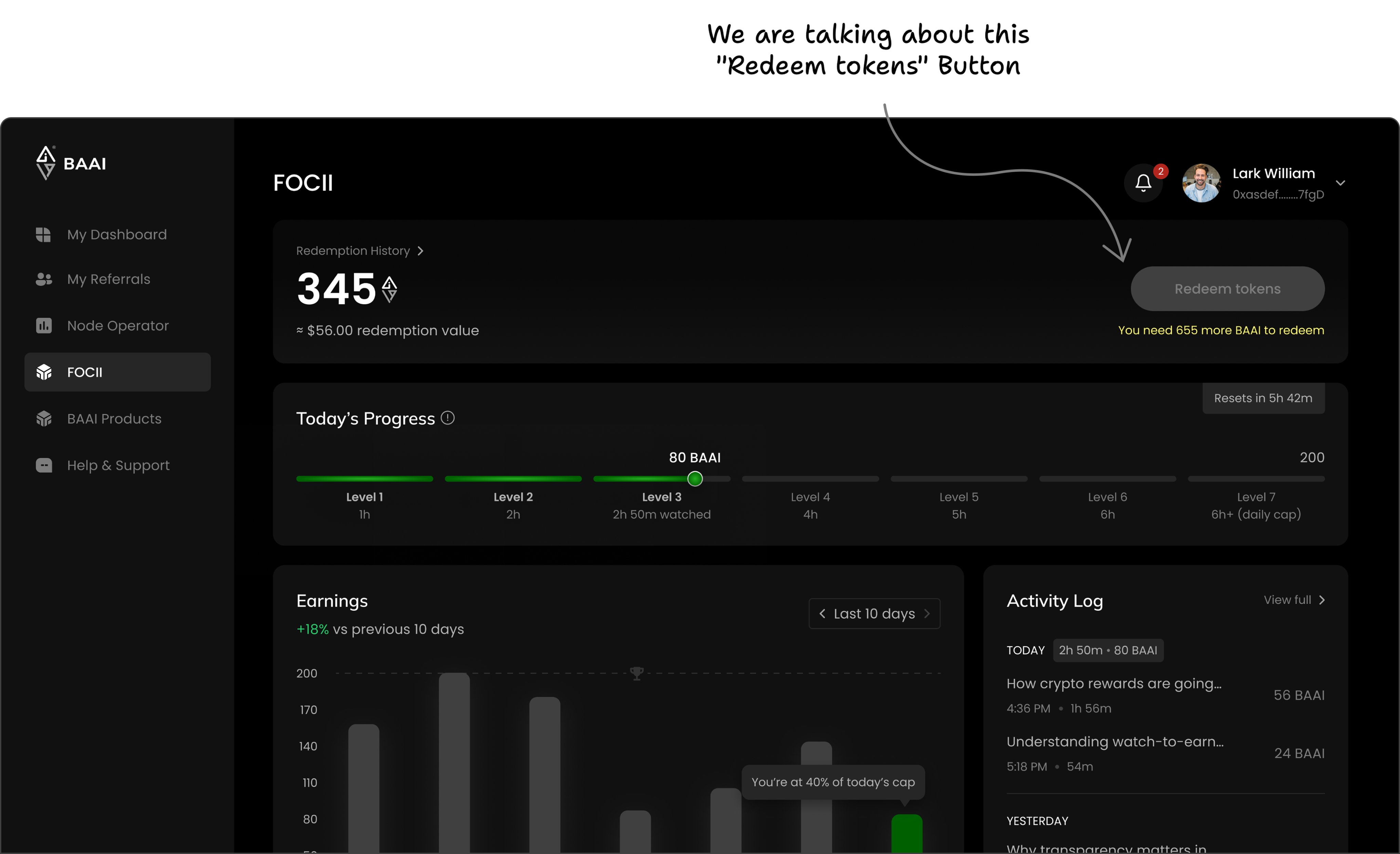
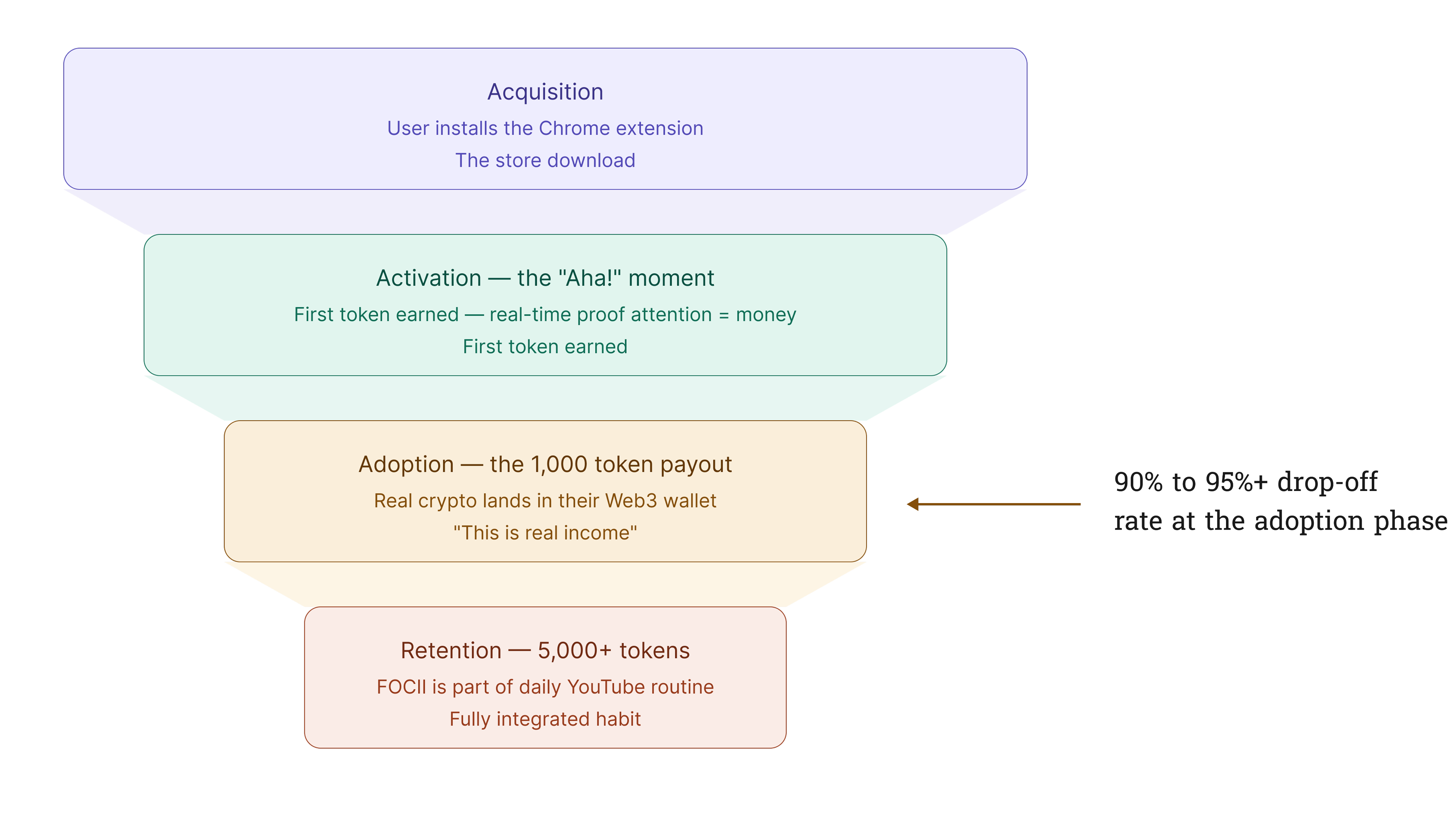
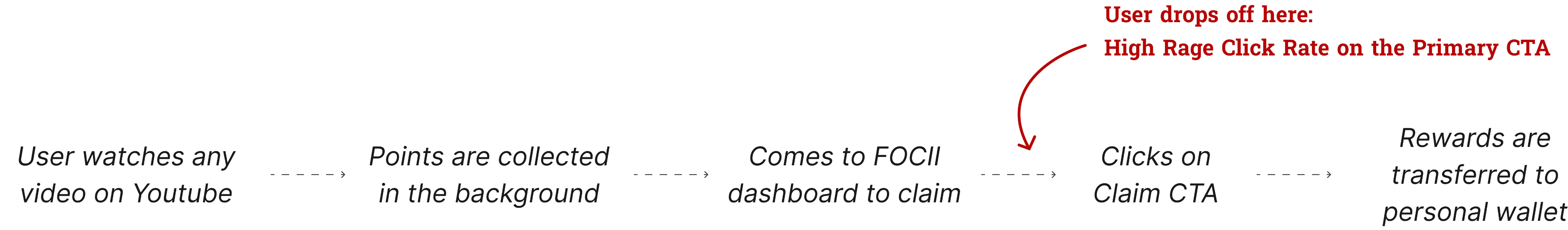
The FOCII browser extension has a severe 92% Adoption Failure Rate, where 173 downloads reduced to just >15 active users. Most users quit right before being able to collect their rewards, as there is a high "Rage Click" Rate on the “Claim” button and massive drop-offs at the same time.
Business Impact: The Token Collapse
A crypto token like BAAI needs three things to survive:
- Trading (Easy to swap for real money).
- Movement (People constantly passing tokens around).
- Buyers (New people wanting to buy it).
Without these, the token loses all value.
Big investors and crypto exchanges look at one main number: Active Wallets (how many people use the token daily).
- The Reality: Out of 173 downloads, fewer than 15 people have been able to get the BAAI tokens into their crypto wallets.
- The Result: Because so few people were trading with this token, its price could hardly increase, making it an unappealing investment for crypto investors.
The Damage Done:
- No Value: Absolutely no one was buying the BAAI token, causing its value to crash in the crypto market.
- Wasted Money: All the money the company spent on engineering, testing, and launching the token was going completely down the drain.
- No Funding: BrainAlive could not get new investors because the user count was too low.
Strategic Business Goals
To increase the FOCII extension’s Feature Adoption Rate from 8% to 50% within the next 3 months by reducing drop-offs at the adoption phase.
- Boost Active Users: Grow the number of active users from fewer than 15 to a thriving number that holds and transacts the BAAI token daily.
- Fix Token Value: Get users trading the token every day so its value stops dropping and crypto exchanges see it as a lucrative investment.
- Recover Lost Capital: Turn the expensive custom code that the company already built into a profitable asset, ensuring future revenue directly balances out the initial launch expenses.
Technical Constraints
The company had already lost substantial capital launching this token ecosystem and could not afford a total code overhaul.
The company allocated a focused 2-week front-end engineering sprint specifically to fix the broken adoption funnel. Because the system was already tracking watch times and token counts behind the scenes, we did not have to build any new back-end tech. This allowed us to execute a complete front-end design, visually reorganizing the existing data that the engineering team could easily deploy within 10 working days.
Success Metrics (Quantitave)
Quantitative:
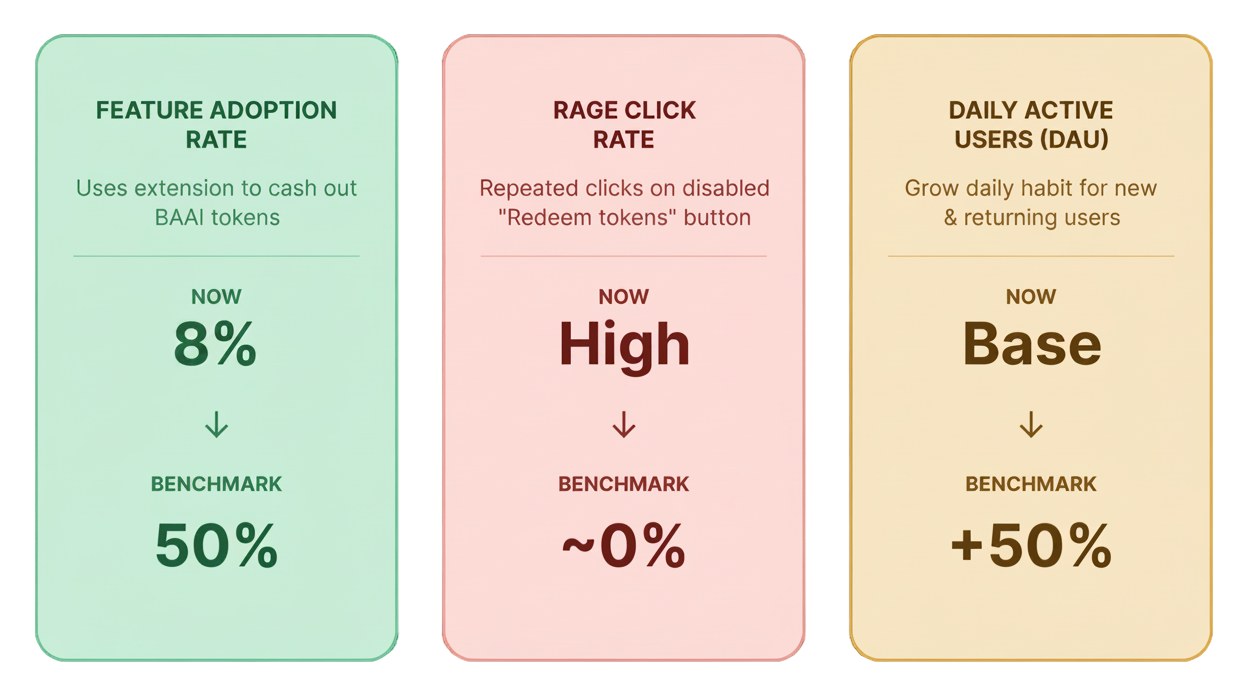
- Feature Adoption Rate: The percentage of users who install the extension and actually use its core features to successfully cash out their BAAI tokens. We aim to increase this from 8% to 50% in the next 3 months.
- Rage Click Rate: How often a user repeatedly clicks the disabled "Redeem tokens" CTA button out of confusion or anger. Drop this rate close to 0% by clearly displaying the eligibility rules.
- Daily Active Users (DAU): Grow our total daily active community by at least 50% by turning the app into a daily habit for both new and returning old users.
My Approach to Solve the Leaky Adoption
01

Find the Gap
Identified ambiguity in the user journey through moderated usability tests (n=10)
02
Explore Solutions
Tested alternative layout structures to determine which hierarchy improved clarity around eligibility (n=14)
03
Final Design
Implemented the variant which performed better in terms of productivity and usability
Pattern Observed in the User Journey
Primary Research: Qualitative (Multi-method)
Interviews + Concept Testing: Ran 10 moderated sessions to find why the users were dropping-off before they could claim their rewards.
User Type: Return and Repeat users (only the ones who were not eligible to redeem i.e. hadn’t collected 1000 BAAI tokens yet)
Insights we got from the Talking to the Users
01
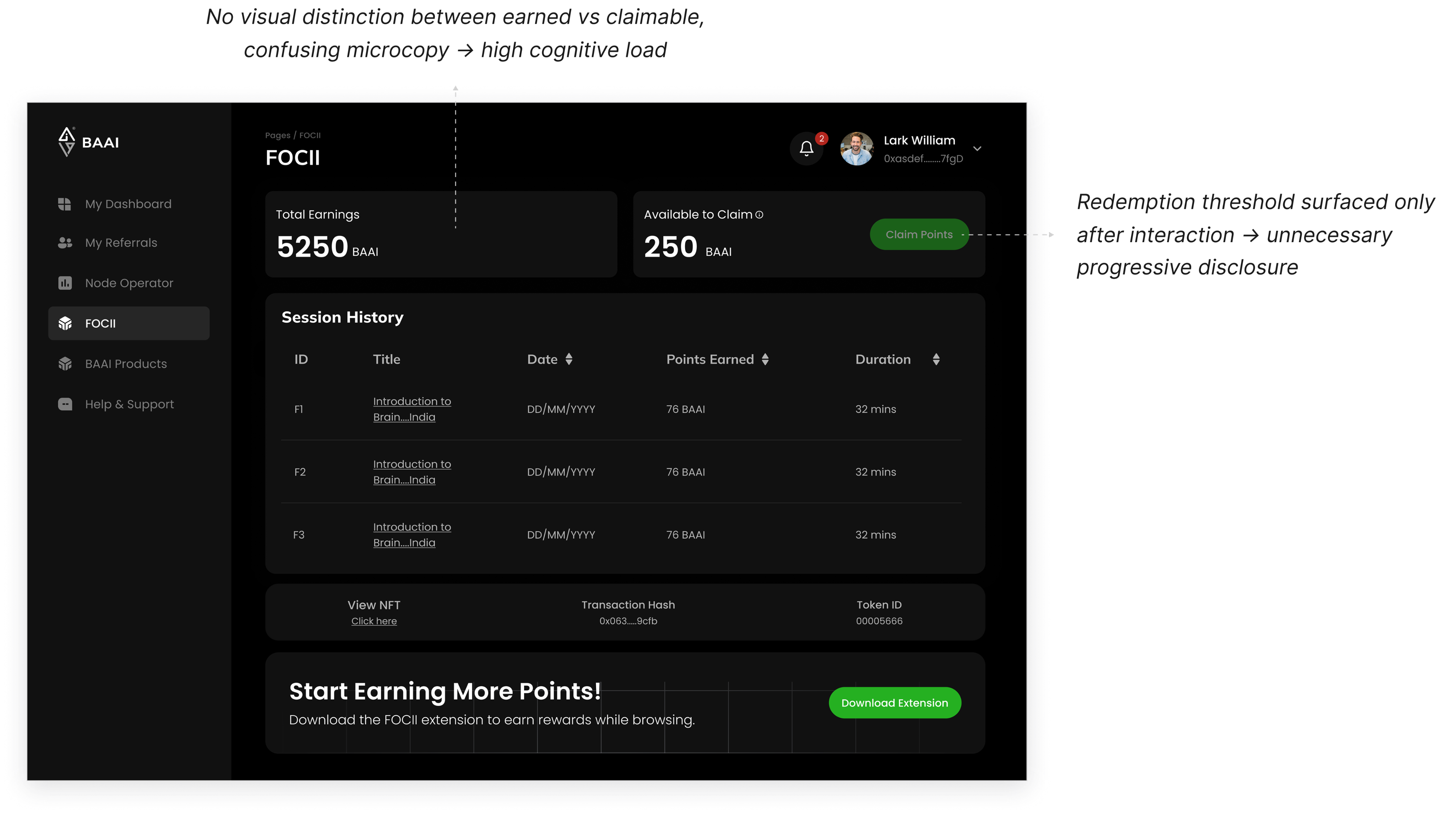
Confusing balances
Users couldn't tell the difference between "Total Earnings" from "Available to Claim?”
02
Invisible Threshold
Redemption requirement (i.e. 1000 tokens) was not visible upfront
03
Unpredictable Earnings
Users had no idea how much they were actually making per hour
Strategic Design Interventions
- IF we remove the extra visual clutter (such as Lifetime Earnings, promotional banners, NFT information, etc) and show the exact eligibility criteria upfront, THEN the high Rage Click rate on the primary CTA will drop, BECAUSE users will instantly understand why the button is disabled.
- IF we add a visual progress bar showing their journey toward the 200-token max daily cap, THEN daily user engagement will increase, leading to a higher Daily Active User (DAU) count, BECAUSE it creates an easy, gamified daily milestone that motivates users to keep using the app until they hit their limit.
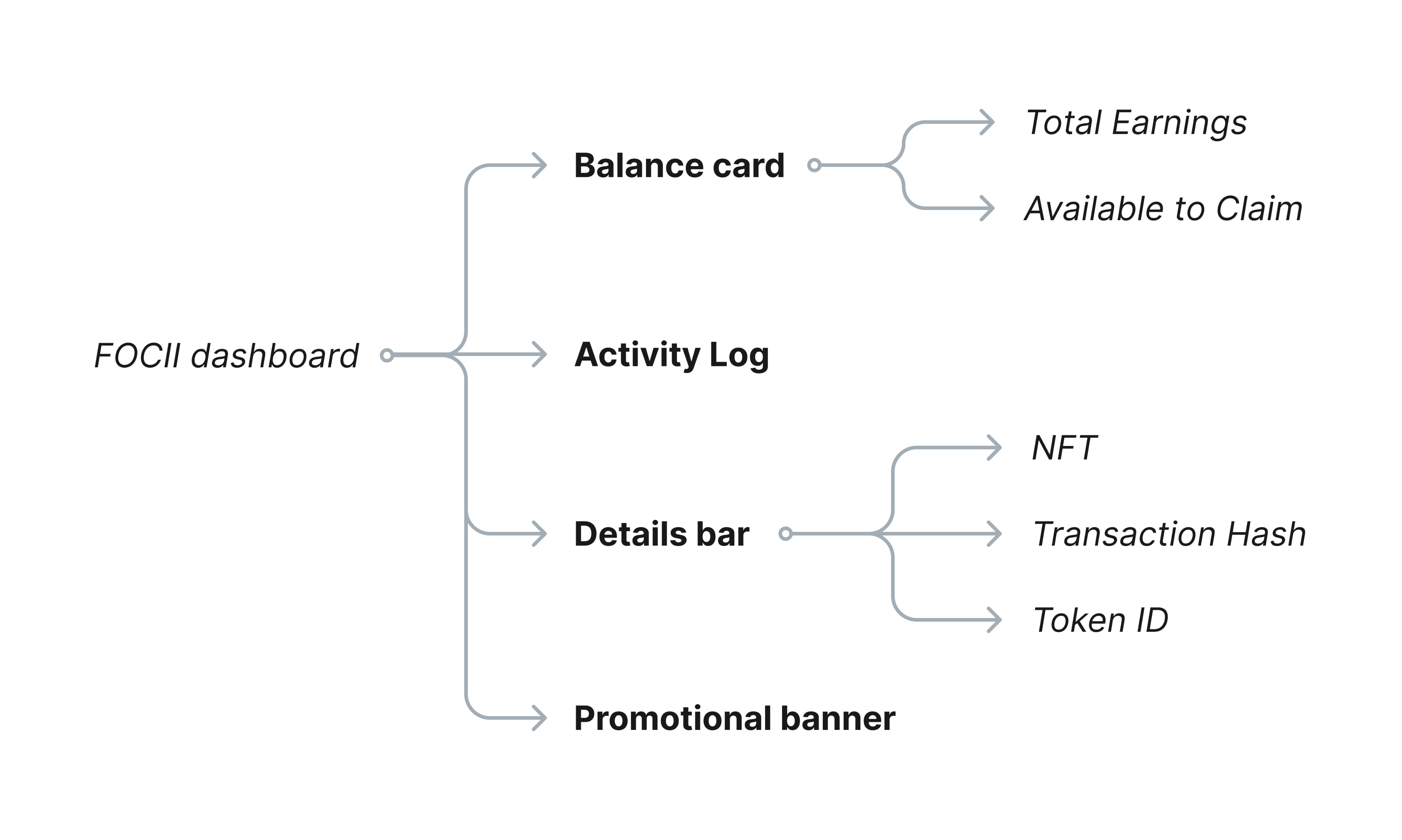
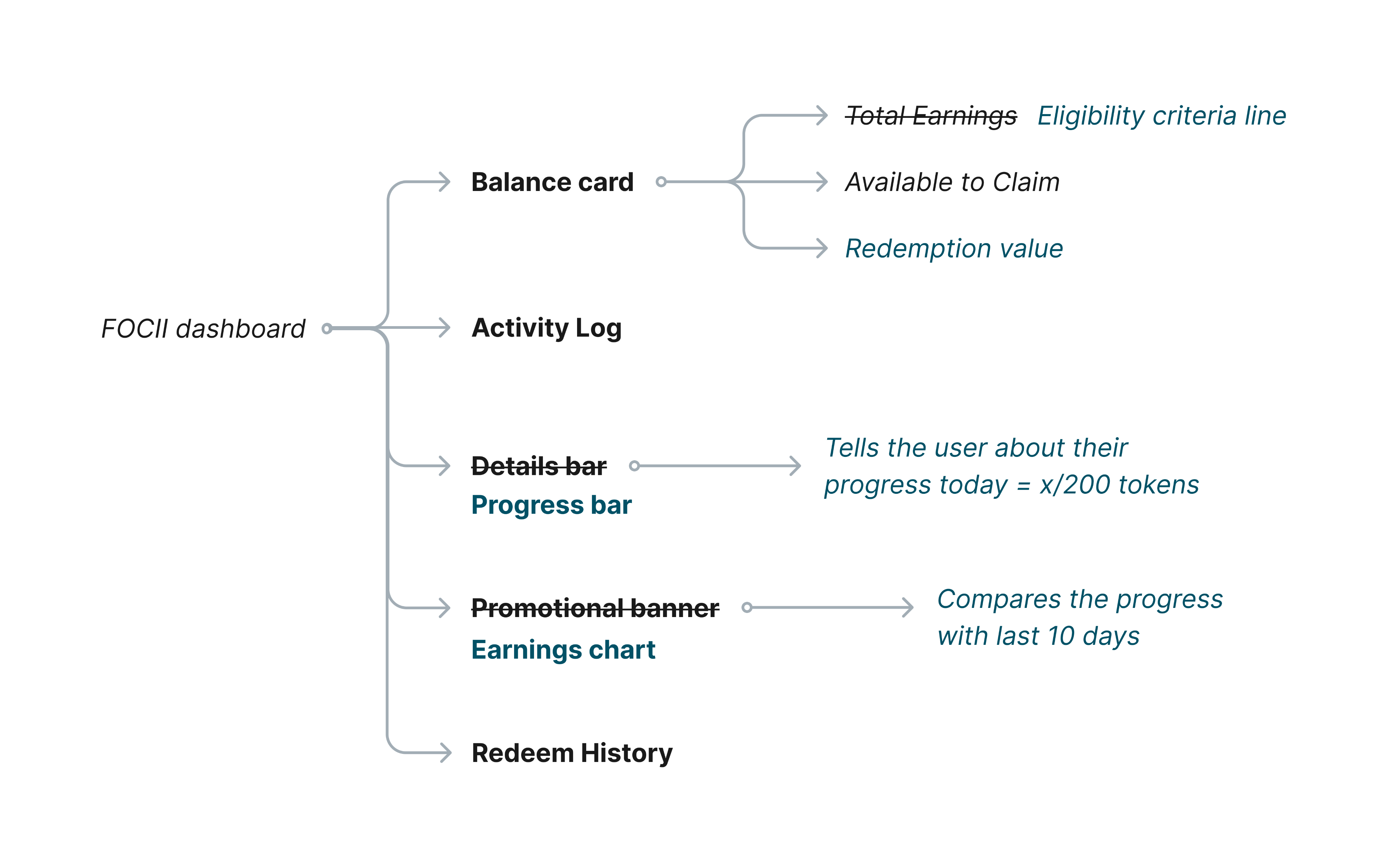
Had to Restructure the Information Architecture
Original Information Architecture of the Dashboard

Updated Information Architecture of the Dashboard
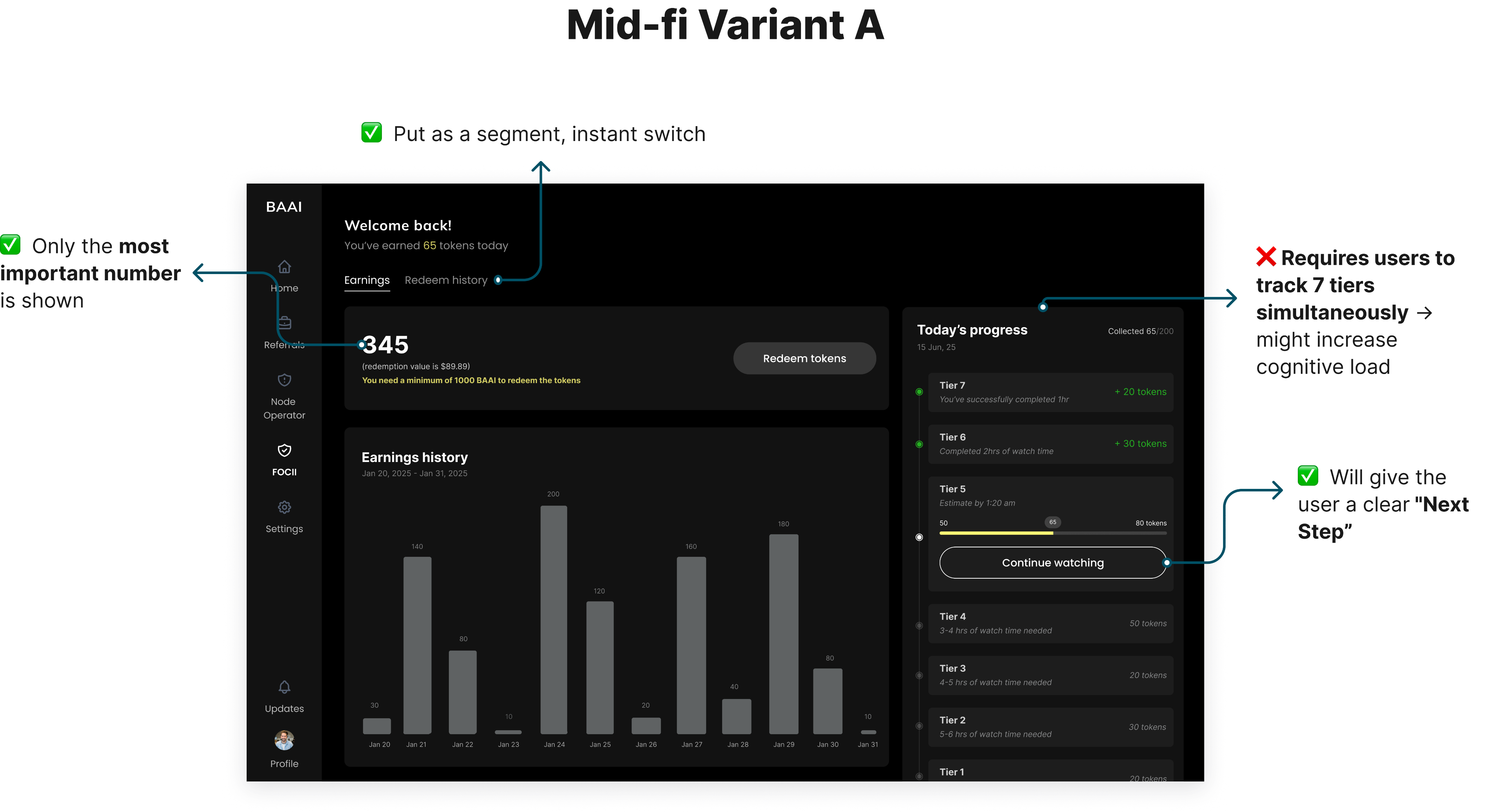
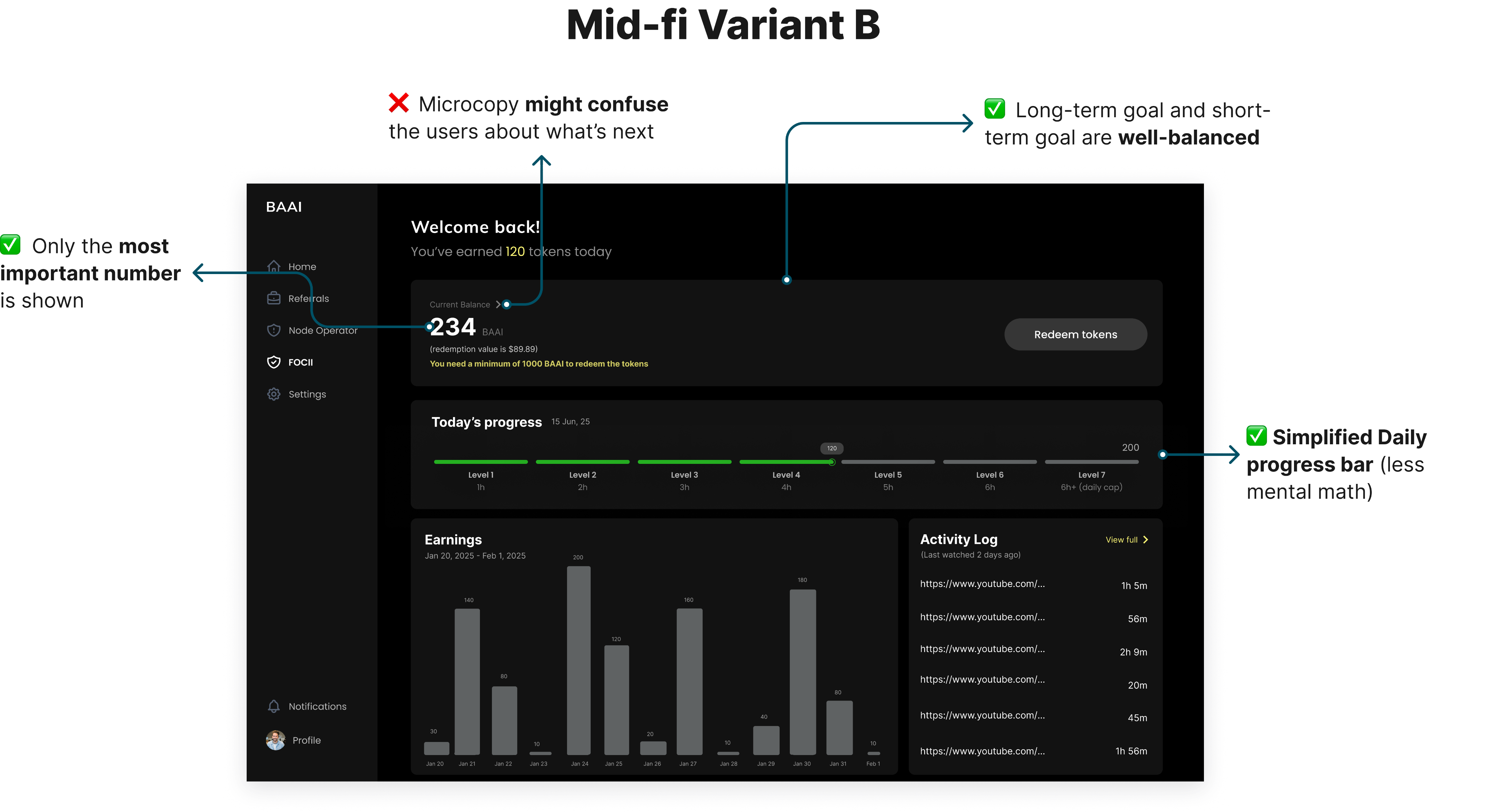
Created 2 Mid-Fidelity Variations
Tested Both the Variants with Users
- Qualitative Split Testing + Interviews
- Group 1 = Variant A, Group 2 = Variant B
- N=14 (new users)
- Metrics defined: Time-on-Task, Task Success Rate
Criteria for Testing: How clear were the users with Current Balance Clarity, Redeem History, Threshold (1000 tokens) and Today’s Progress
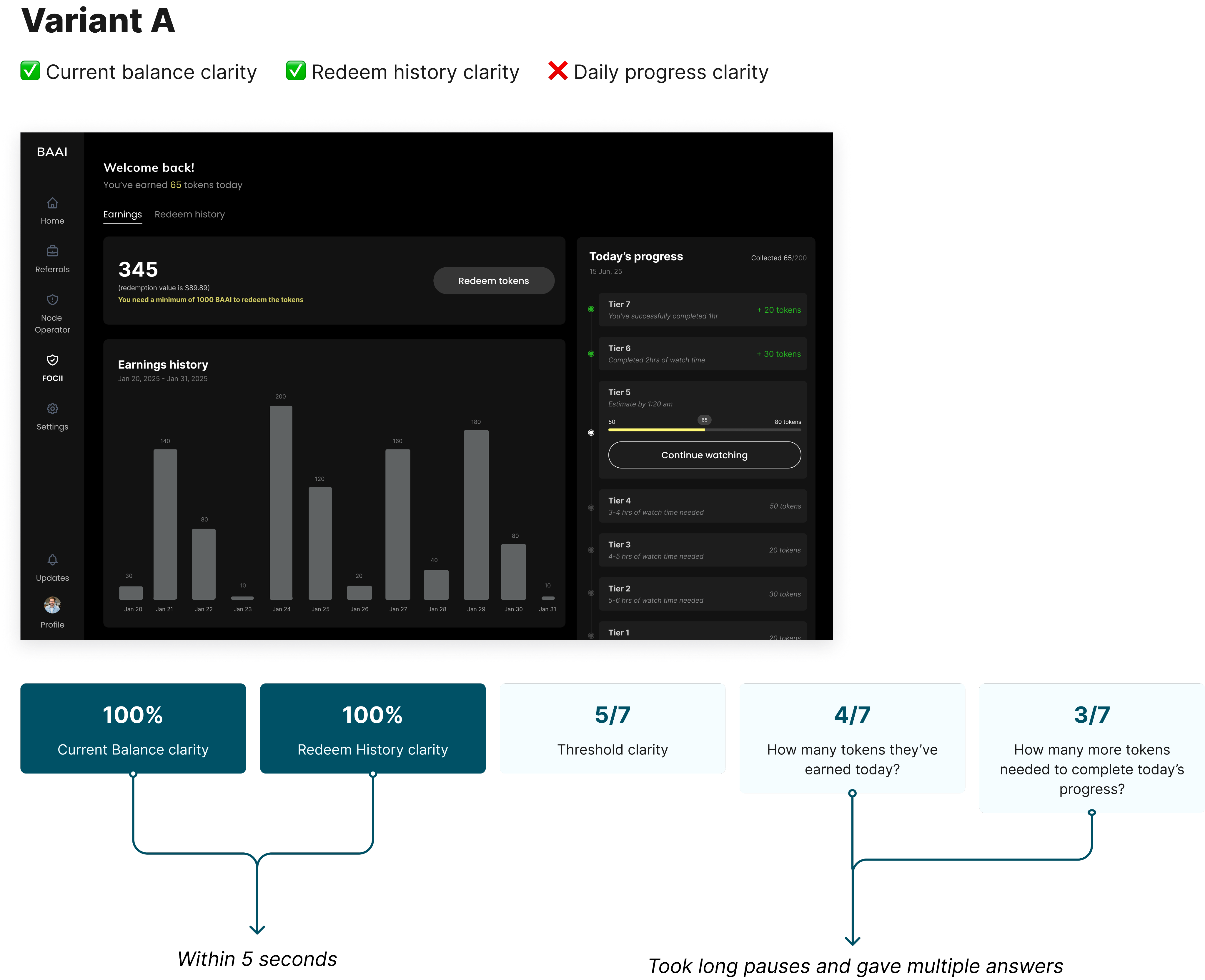
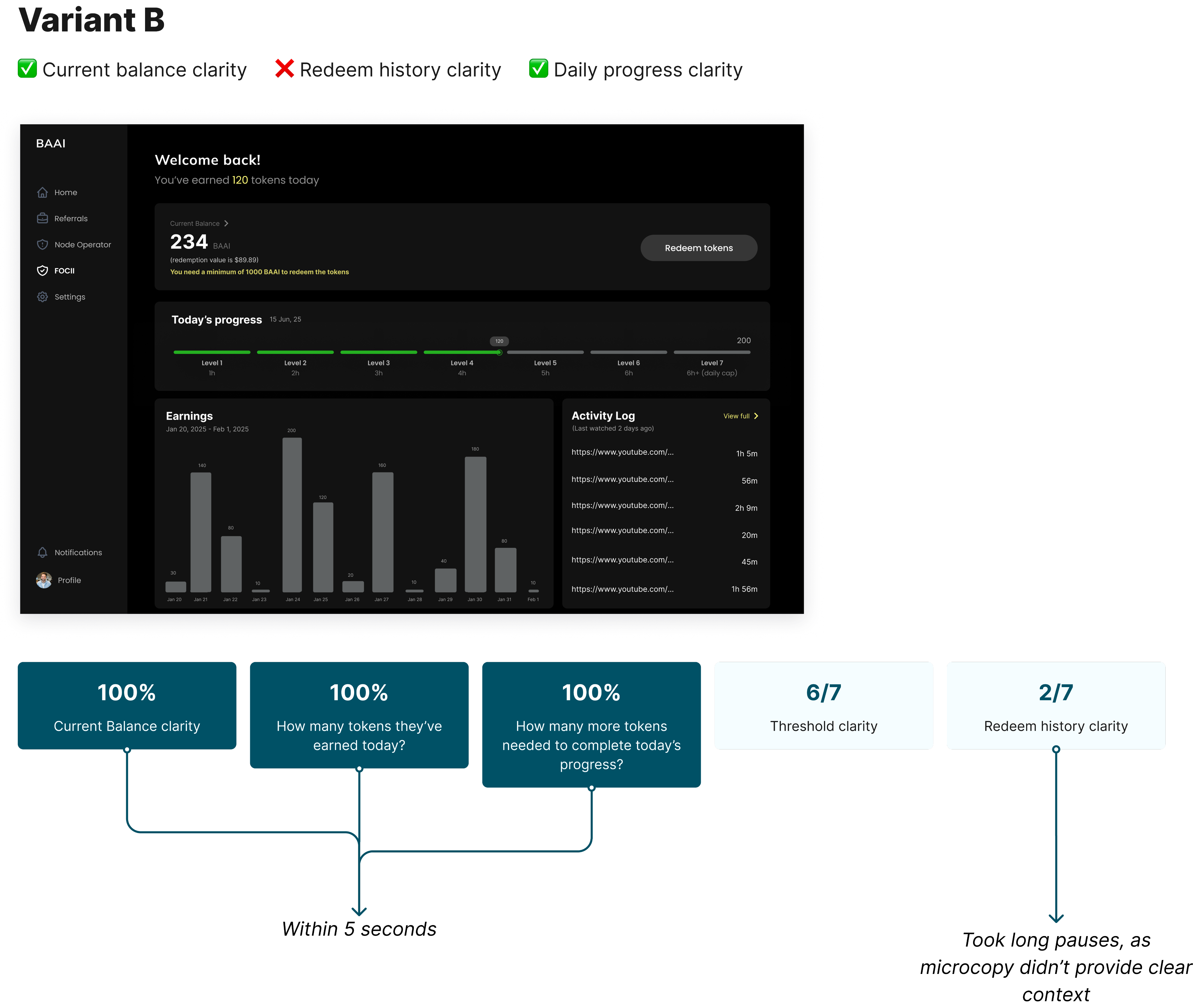
Better Performing Design: Variant B
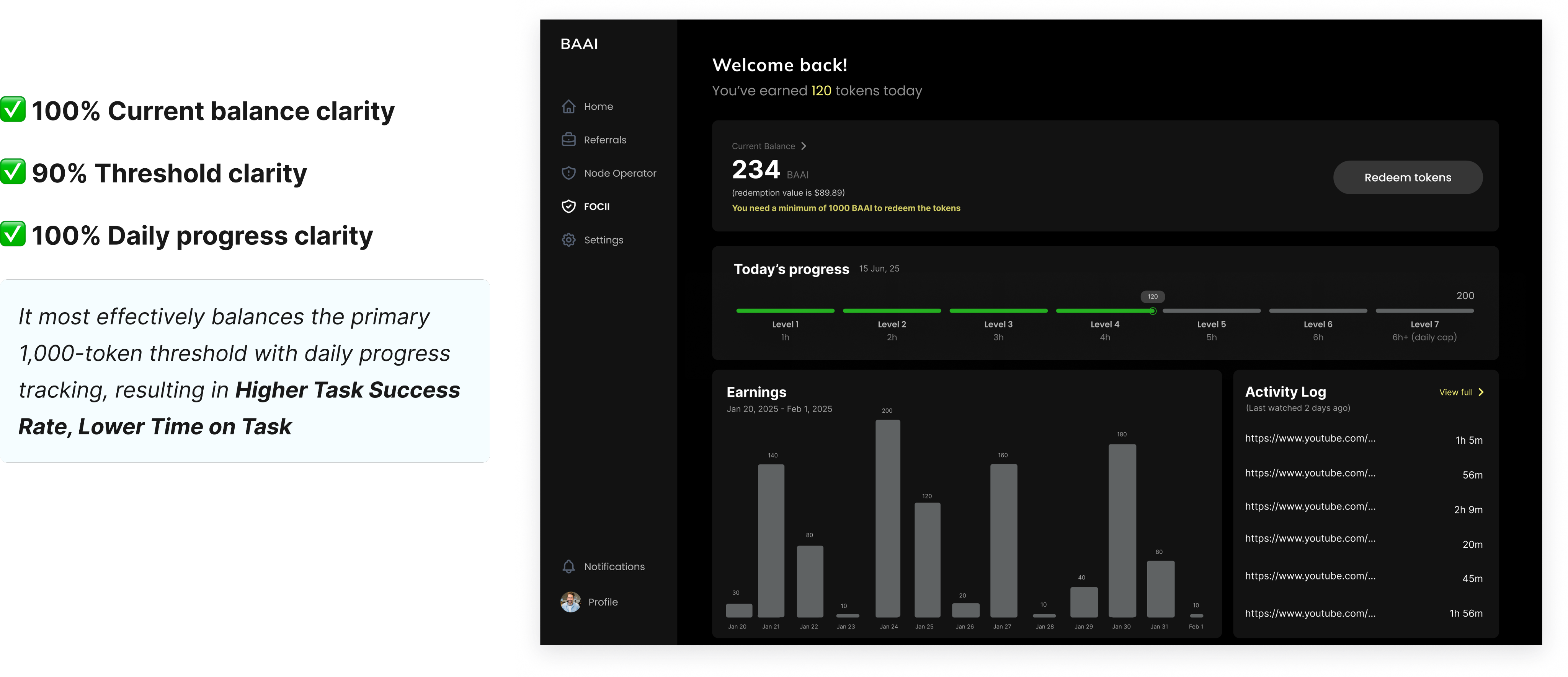
But again we received some common insights from both the variants which were:
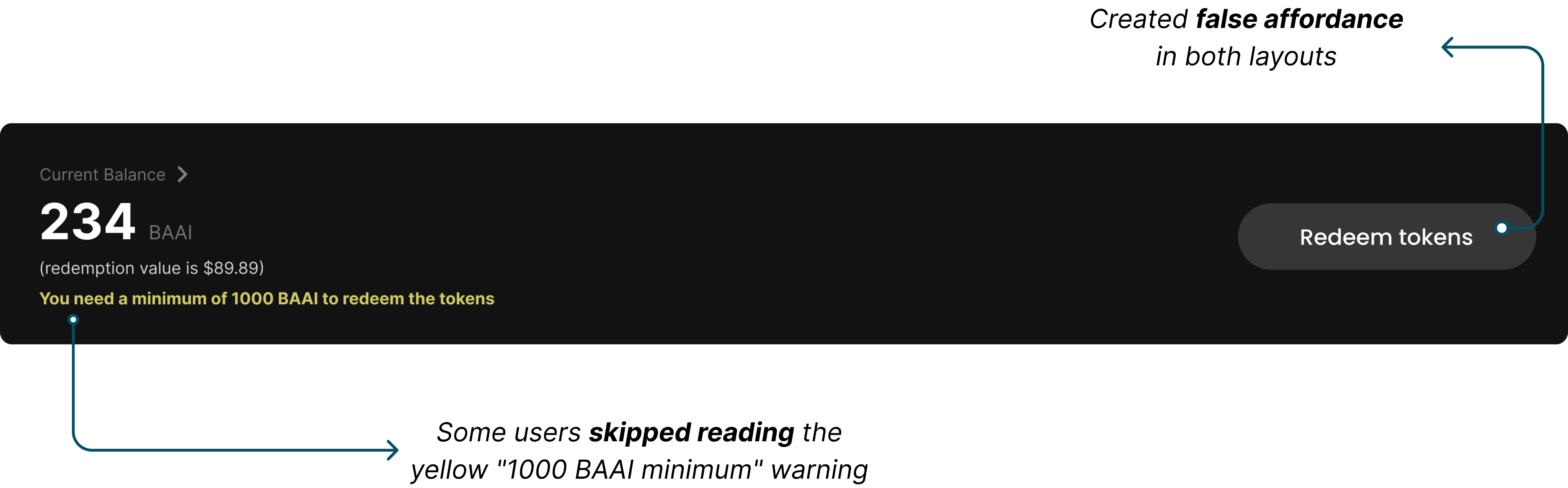
Final Design: Variant B (with minor changes)
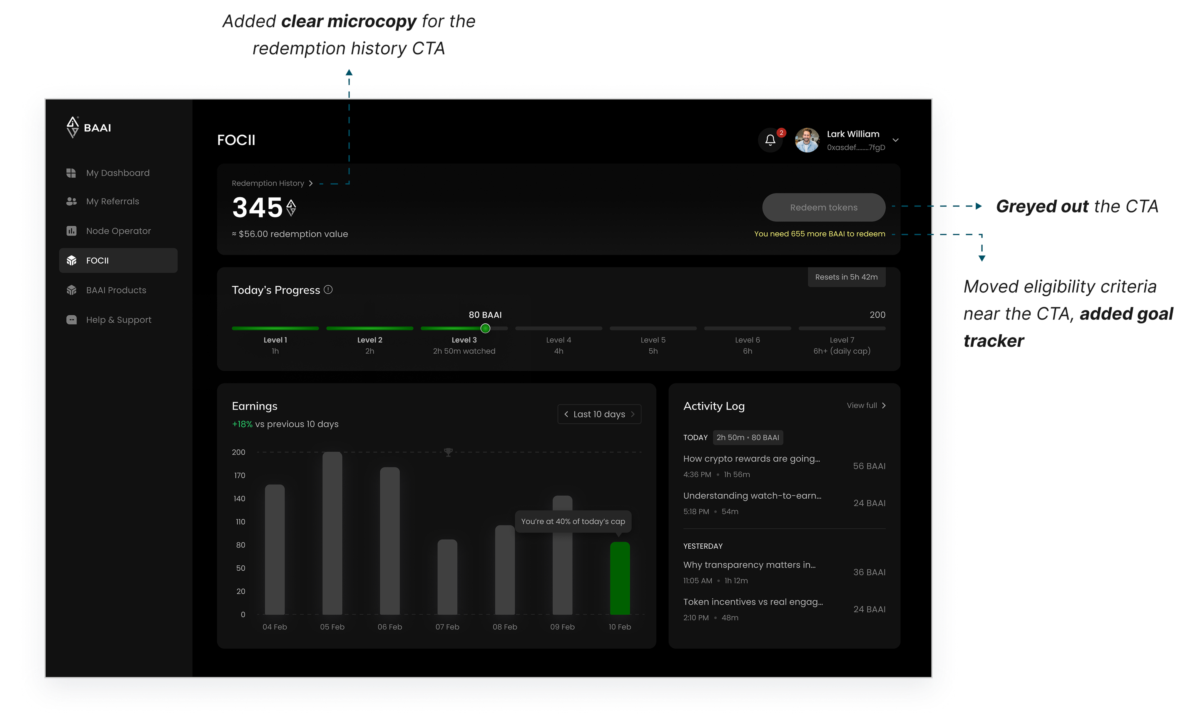
Designed for Critical Thresholds
➡️ Threshold 1: Daily Earning Cap (200 tokens)
➡️ Threshold 2: The Redemption Unlock (1000 tokens)
Projected Impact
✅ Increase in Feature Adoption
Increase from 8% to 50%
✅ Decreased Rage Click Rate
Reduced from a high % to almost 0%
✅ Increased DAU
Increase by at least 50% by turning the app into a daily habit for both new and returning old users.
Learnings and reflection
Designing for trust
- Trust breaks at decision points, not in happy paths
- Making eligibility explicit reduced “is this fair?” doubt
Test early, save effort
- Wireframe testing exposed rule confusion early
- It saved rework by locking structure before UI polish
Thank you for reading! Explore my other case studies below to see how I approach different product problems.

@Let’s build something together

Increasing Feature Adoption from 8% to 50% within 3 Months
This project resolves user confusion and extreme drop-offs at the final reward claiming stage to increase daily active users, revive market demand, and compensate for the company's initial engineering costs.
Type: B2C
Industry: Fintech, Web3 & Crypto
Team: 1 Product Designer (me), 1 UX Researcher, Product Manager, Marketing Head
My Role: End-to-end UX ownership, leading discovery, comparative usability testing, and final UI execution
About FOCII
FOCII is an AI-driven verification tool designed to prove a YouTube viewer is an actual human being rather than a bot. It rewards you for your Youtube engagement, by passively tracking attention.
- How it works: It uses your desktop webcam to track face and eye movement while you watch YouTube videos to gather engagement analytics.
- Adoption Number: Currently in its Minimum Viable Product (MVP) beta testing phase and has 173 active users on the Chrome Web Store. It was rolled out around June 2024.
Target Audience
Over 25 million people worldwide are heavy daily internet users who also own crypto, making them a highly active and valuable audience.
Problem Statement
The FOCII browser extension has a severe 92% Adoption Failure Rate, where 173 downloads reduced to just >15 active users. Most users quit right before being able to collect their rewards, as there is a high "Rage Click" Rate on the “Claim” button and massive drop-offs at the same time.
Business Impact: The Token Collapse
A crypto token like BAAI needs three things to survive:
- Trading (Easy to swap for real money).
- Movement (People constantly passing tokens around).
- Buyers (New people wanting to buy it).
Without these, the token loses all value.
Big investors and crypto exchanges look at one main number: Active Wallets (how many people use the token daily).
- The Reality: Out of 173 downloads, fewer than 15 people have been able to get the BAAI tokens into their crypto wallets.
- The Result: Because so few people were trading with this token, its price could hardly increase, making it an unappealing investment for crypto investors.
The Damage Done:
- No Value: Absolutely no one was buying the BAAI token, causing its value to crash in the crypto market.
- Wasted Money: All the money the company spent on engineering, testing, and launching the token was going completely down the drain.
- No Funding: BrainAlive could not get new investors because the user count was too low.
Strategic Business Goals
To increase the FOCII extension’s Feature Adoption Rate from 8% to 50% within the next 3 months by reducing drop-offs at the adoption phase.
- Boost Active Users: Grow the number of active users from fewer than 15 to a thriving number that holds and transacts the BAAI token daily.
- Fix Token Value: Get users trading the token every day so its value stops dropping and crypto exchanges see it as a lucrative investment.
- Recover Lost Capital: Turn the expensive custom code that the company already built into a profitable asset, ensuring future revenue directly balances out the initial launch expenses.
Technical Constraints
The company had already lost substantial capital launching this token ecosystem and could not afford a total code overhaul.
The company allocated a focused 2-week front-end engineering sprint specifically to fix the broken adoption funnel. Because the system was already tracking watch times and token counts behind the scenes, we did not have to build any new back-end tech. This allowed us to execute a complete front-end design, visually reorganizing the existing data that the engineering team could easily deploy within 10 working days.
Success Metrics (Quantitave)
Quantitative:
- Feature Adoption Rate: The percentage of users who install the extension and actually use its core features to successfully cash out their BAAI tokens. We aim to increase this from 8% to 50% in the next 3 months.
- Rage Click Rate: How often a user repeatedly clicks the disabled "Redeem tokens" CTA button out of confusion or anger. Drop this rate close to 0% by clearly displaying the eligibility rules.
- Daily Active Users (DAU): Grow our total daily active community by at least 50% by turning the app into a daily habit for both new and returning old users.
My Approach to Solve the Leaky Adoption
01
Find the Gap
Identified ambiguity in the user journey through moderated usability tests (n=10)
02
Explore Solutions
Tested alternative layout structures to determine which hierarchy improved clarity around eligibility (n=14)
03
Final Design
Implemented the variant which performed better in terms of productivity and usability
Pattern Observed in the User Journey
Primary Research: Qualitative (Multi-method)
Interviews + Concept Testing: Ran 10 moderated sessions to find why the users were dropping-off before they could claim their rewards.
User Type: Return and Repeat users (only the ones who were not eligible to redeem i.e. hadn’t collected 1000 BAAI tokens yet)
Insights we got from the Talking to the Users
01
Confusing balances
Users couldn't tell the difference between "Total Earnings" from "Available to Claim?”
02
Invisible Threshold
Redemption requirement (i.e. 1000 tokens) was not visible upfront
03
Unpredictable Earnings
Users had no idea how much they were actually making per hour
Strategic Design Interventions
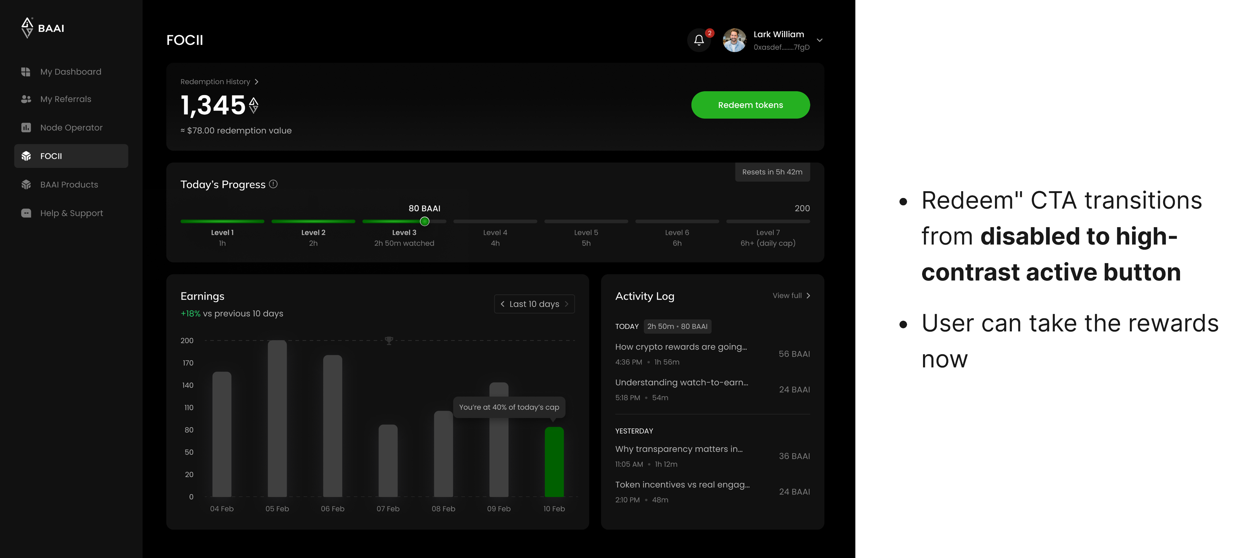
- IF we remove the extra visual clutter (such as Lifetime Earnings, promotional banners, NFT information, etc) and show the exact eligibility criteria upfront, THEN the high Rage Click rate on the primary CTA will drop, BECAUSE users will instantly understand why the button is disabled.
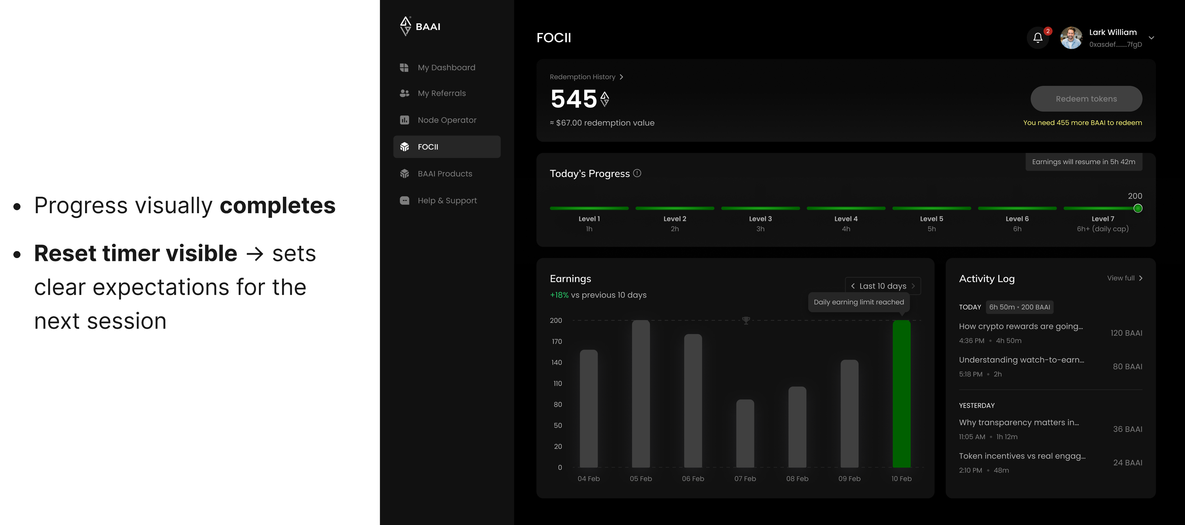
- IF we add a visual progress bar showing their journey toward the 200-token max daily cap, THEN daily user engagement will increase, leading to a higher Daily Active User (DAU) count, BECAUSE it creates an easy, gamified daily milestone that motivates users to keep using the app until they hit their limit.
Had to Restructure the Information Architecture
Original Information Architecture of the Dashboard
Updated Information Architecture of the Dashboard
Created 2 Mid-Fidelity Variations
Tested Both the Variants with Users
- Qualitative Split Testing + Interviews
- Group 1 = Variant A, Group 2 = Variant B
- N=14 (new users)
- Metrics defined: Time-on-Task, Task Success Rate
Criteria for Testing: How clear were the users with Current Balance Clarity, Redeem History, Threshold (1000 tokens) and Today’s Progress
Better Performing Design: Variant B
But again we received some common insights from both the variants which were:
Final Design: Variant B (with minor changes)
Designed for Critical Thresholds
➡️ Threshold 1: Daily Earning Cap (200 tokens)
➡️ Threshold 2: The Redemption Unlock (1000 tokens)
Projected Impact
✅ Increase in Feature Adoption
Increase from 8% to 50%
✅ Decreased Rage Click Rate
Reduced from a high % to almost 0%
✅ Increased DAU
Increase by at least 50% by turning the app into a daily habit for both new and returning old users.
Learnings and reflection
Designing for trust
- Trust breaks at decision points, not in happy paths
- Making eligibility explicit reduced “is this fair?” doubt
Test early, save effort
- Wireframe testing exposed rule confusion early
- It saved rework by locking structure before UI polish
Thank you for reading! Explore my other case studies below to see how I approach different product problems.

@Let’s build something together
Contact me
LinkedInIncreasing Feature Adoption from 8% to 50% within 3 Months
This project resolves user confusion and extreme drop-offs at the final reward claiming stage to increase daily active users, revive market demand, and compensate for the company's initial engineering costs.
Type: B2C
Industry: Fintech, Web3 & Crypto
Team: 1 Product Designer (me), 1 UX Researcher, Product Manager, Marketing Head
My Role: End-to-end UX ownership, leading discovery, comparative usability testing, and final UI execution
About FOCII
FOCII is an AI-driven verification tool designed to prove a YouTube viewer is an actual human being rather than a bot. It rewards you for your Youtube engagement, by passively tracking attention.
- How it works: It uses your desktop webcam to track face and eye movement while you watch YouTube videos to gather engagement analytics.
- Adoption Number: Currently in its Minimum Viable Product (MVP) beta testing phase and has 173 active users on the Chrome Web Store. It was rolled out around June 2024.
Target Audience
Over 25 million people worldwide are heavy daily internet users who also own crypto, making them a highly active and valuable audience.
Problem Statement
The FOCII browser extension has a severe 92% Adoption Failure Rate, where 173 downloads reduced to just >15 active users. Most users quit right before being able to collect their rewards, as there is a high "Rage Click" Rate on the “Claim” button and massive drop-offs at the same time.
Business Impact: The Token Collapse
A crypto token like BAAI needs three things to survive:
- Trading (Easy to swap for real money).
- Movement (People constantly passing tokens around).
- Buyers (New people wanting to buy it).
Without these, the token loses all value.
Big investors and crypto exchanges look at one main number: Active Wallets (how many people use the token daily).
- The Reality: Out of 173 downloads, fewer than 15 people have been able to get the BAAI tokens into their crypto wallets.
- The Result: Because so few people were trading with this token, its price could hardly increase, making it an unappealing investment for crypto investors.
The Damage Done:
- No Value: Absolutely no one was buying the BAAI token, causing its value to crash in the crypto market.
- Wasted Money: All the money the company spent on engineering, testing, and launching the token was going completely down the drain.
- No Funding: BrainAlive could not get new investors because the user count was too low.
Strategic Business Goals
To increase the FOCII extension’s Feature Adoption Rate from 8% to 50% within the next 3 months by reducing drop-offs at the adoption phase.
- Boost Active Users: Grow the number of active users from fewer than 15 to a thriving number that holds and transacts the BAAI token daily.
- Fix Token Value: Get users trading the token every day so its value stops dropping and crypto exchanges see it as a lucrative investment.
- Recover Lost Capital: Turn the expensive custom code that the company already built into a profitable asset, ensuring future revenue directly balances out the initial launch expenses.
Technical Constraints
The company had already lost substantial capital launching this token ecosystem and could not afford a total code overhaul.
The company allocated a focused 2-week front-end engineering sprint specifically to fix the broken adoption funnel. Because the system was already tracking watch times and token counts behind the scenes, we did not have to build any new back-end tech. This allowed us to execute a complete front-end design, visually reorganizing the existing data that the engineering team could easily deploy within 10 working days.
Success Metrics (for next 3 months)
Quantitative:
- Feature Adoption Rate: The percentage of users who install the extension and actually use its core features to successfully cash out their BAAI tokens. We aim to increase this from 8% to 50% in the next 3 months.
- Rage Click Rate: How often a user repeatedly clicks the disabled "Redeem tokens" CTA button out of confusion or anger. Drop this rate close to 0% by clearly displaying the eligibility rules.
- Daily Active Users (DAU): Grow our total daily active community by at least 50% by turning the app into a daily habit for both new and returning old users.
My Approach to Solve the Leaky Adoption
01
Find the Gap
Identified ambiguity in the user journey through moderated usability tests (n=10)
02
Explore Solutions
Tested alternative layout structures to determine which hierarchy improved clarity around eligibility (n=14)
03
Final Design
Implemented the variant which performed better in terms of productivity and usability
Pattern Observed in the User Journey
Primary Research: Qualitative (Multi-method)
Interviews + Concept Testing: Ran 10 moderated sessions to find why the users were dropping-off before they could claim their rewards.
User Type: Return and Repeat users (only the ones who were not eligible to redeem i.e. hadn’t collected 1000 BAAI tokens yet)
Insights we got from the Talking to the Users
01
Confusing balances
Users couldn't tell the difference between "Total Earnings" from "Available to Claim?”
02
Invisible Threshold
Redemption requirement (i.e. 1000 tokens) was not visible upfront
03
Unpredictable Earnings
Users had no idea how much they were actually making per hour
Strategic Design Interventions
- IF we remove the extra visual clutter (such as Lifetime Earnings, promotional banners, NFT information, etc) and show the exact eligibility criteria upfront, THEN the high Rage Click rate on the primary CTA will drop, BECAUSE users will instantly understand why the button is disabled.
- IF we add a visual progress bar showing their journey toward the 200-token max daily cap, THEN daily user engagement will increase, leading to a higher Daily Active User (DAU) count, BECAUSE it creates an easy, gamified daily milestone that motivates users to keep using the app until they hit their limit.
Had to Restructure the Information Architecture
Original Information Architecture of the Dashboard
Updated Information Architecture of the Dashboard
Created 2 Mid-Fidelity Variations
Tested Both the Variants with Users
- Qualitative Split Testing + Interviews
- Group 1 = Variant A, Group 2 = Variant B
- N=14 (new users)
- Metrics defined: Time-on-Task, Task Success Rate
Criteria for Testing: How clear were the users with Current Balance Clarity, Redeem History, Threshold (1000 tokens) and Today’s Progress
Better Performing Design: Variant B
But again we received some common insights from both the variants which were:
Final Design: Variant B (with minor changes)
Designed for Critical Thresholds
➡️ Threshold 1: Daily Earning Cap (200 tokens)
➡️ Threshold 2: The Redemption Unlock (1000 tokens)
Projected Impact
✅ Increase in Feature Adoption
Increase from 8% to 50%
✅ Decreased Rage Click Rate
Reduced from a high % to almost 0%
✅ Increased DAU
Increase by at least 50% by turning the app into a daily habit for both new and returning old users.
Learnings and reflection
Designing for trust
- Trust breaks at decision points, not in happy paths
- Making eligibility explicit reduced “is this fair?” doubt
Test early, save effort
- Wireframe testing exposed rule confusion early
- It saved rework by locking structure before UI polish
Thank you for reading! Explore my other case studies below to see how I approach different product problems.

@Let’s build something together
Contact me
LinkedIn